Show and Tell Newsletter
Logo design, identity
I wanted to launch a newsletter that analysed images and their cultural context. Semiotics, or the study of signs and symbols, was the focus of my master's thesis, and I knew that it would be relevant, given the increasingly image-driven world we live in.
I had a great name for the newsletter: "Show and Tell". What I wanted was a logo that worked with the concept.
I thought this process would be ideal for a case study on logo design, because for once, I could read my client's mind.
I brainstormed several concepts for the logo here. I also studied the logos of other newsletters and podcasts, and noticed that many don't bother with a particularly interesting image, relying instead on their writing skills and/or name recognition. Mine, though, did need a declarative logo, not least because it was a newsletter about images.
I knew I wanted the name in the logo, so it could go out without the name in the title. That's why the concepts I chose are typographical.


I mind-mapped what the newsletter was about and the tone I wanted to achieve.
The keywords that emerged were funny and thoughtful.
It had to work on desktop and mobile, within the Substack environment, and the goal was succinct: To create a newsletter that people wanted to open.
Rendered concepts
Note: If you were a client, I wouldn't show you all these, but rather choose three that I thought worked best. This is both to save your time and to avoid you falling in love with a concept that I know will fail in implementation.


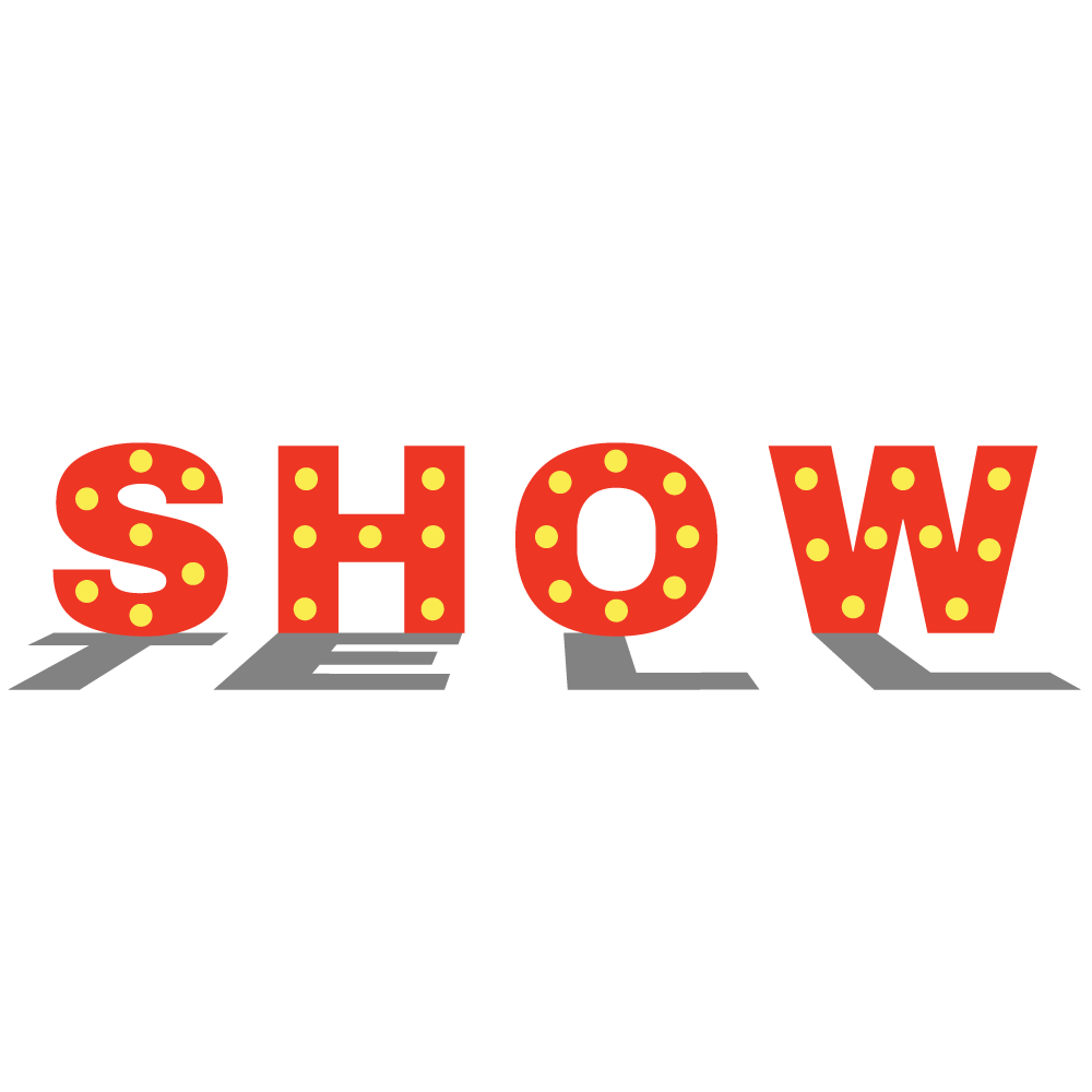
This was the logo I ran with when I launched the newsletter. I thought the concept was great and said exactly what I wanted it to.
After a while though, the text started to seem too narrow to me. I wanted chunkier text and more symmetry.
I decided to make it lit from directly behind for central symmetry, and ensured that it was proportional in a grid. This gave me the final logo, that I also animated for the GIF at the top of this case study.

Mockup created by syifa5610, Freepik